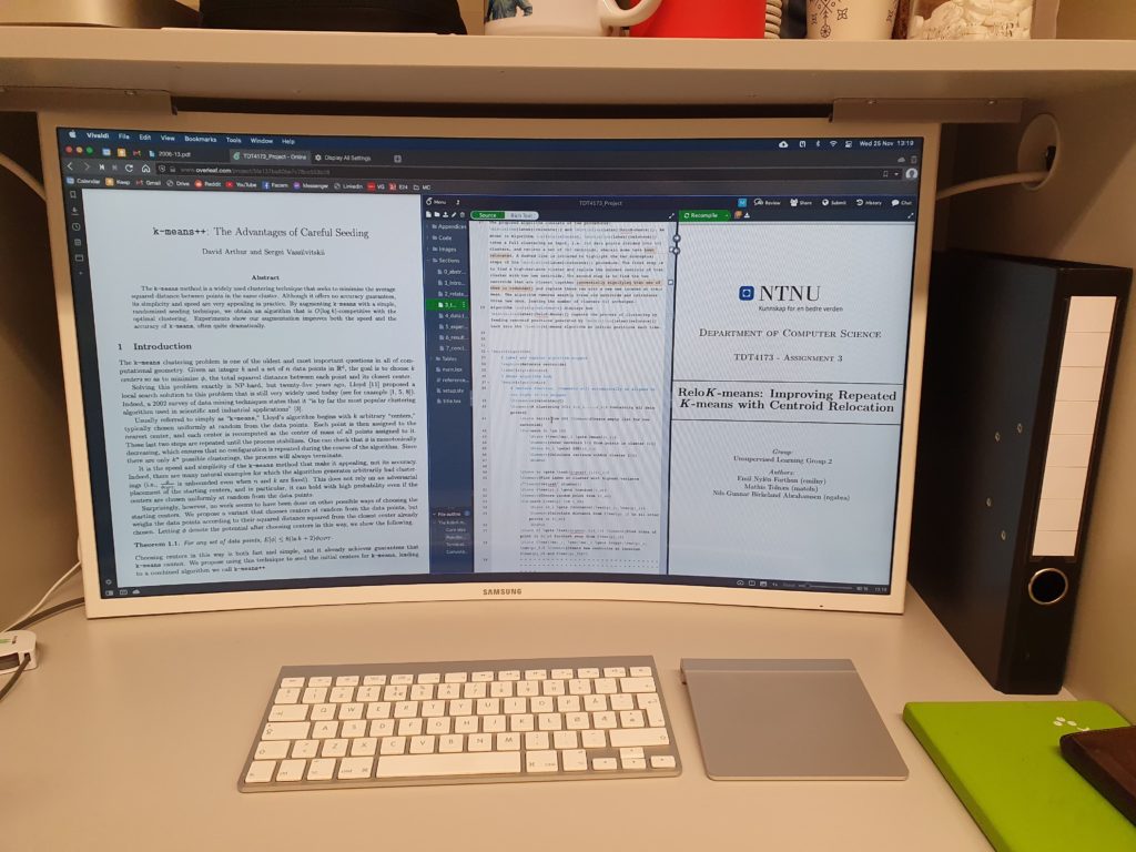
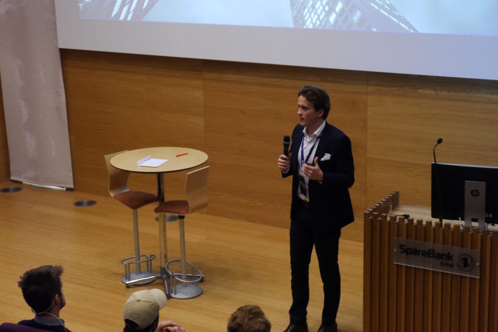
In my introductory blog post, I mentioned that I would like to have other people, different to myself, try Vivaldi. I wanted to observe and evaluate their first impression and see if their way of using it would differ from mine. This week, I introduced my friend Mathis to Vivaldi.

Mathis is one of my closest and brightest friends. He is currently studying at the Norwegian University of Science and Technology where he is studying Industrial Economics and Technology Management with a specialization in Artificial Intelligence.
This week I sat down and introduced him to the Vivaldi browser. I wanted to observe how he would react to the browser, what areas he would like and dislike, as well as if his first impression would differ from my own. I made it clear that I wanted him to be brutally honest and give me his truthful opinion.
He would naturally have me by his side to answer any questions he had, but I intentionally wanted him to explore the browser by himself to begin with. He has now used the browser for one week, and here are some of his first impressions and thoughts.
Initial thoughts
Mathis is very curious by nature. The first 10 minutes he spent by exploring the endless settings and different ways of customization. He changed the default search engine, imported bookmarks and passwords, customized the default zoom settings. All to make the browser feel like what he is used to and comfortable with.
Once he did that, I introduced him to the features I most frequently use and am most impressed with. He, like I, use multiple windows and tabs while studying, which made him very impressed with the Page Tiling feature. We even compared how his regular setup would look in Chrome vs. Vivaldi.
Not only did it look a lot better in Vivaldi, but it was a lot easier and more efficient to set up. He would split the pages in three, one with tasks, one with lecture slides and the last with lecture notes.

One thing that caught Mathis’ attention, which hadn’t caught mine yet, was the different Page Actions, especially the CSS Debugger.
As a Computer Science student, having the opportunity to actively see changes and elements when developing websites is great. He mentions that combining the CSS Debugger function with Page Tiling is very useful, considering at least one tile would be used for Stack Overflow – something he says any other software developer would agree with him on.
He also showed great appreciation for the accessibility and the options for universal design, such as the different filters, fonts and reading views, to make browsing easy for everyone.
“It shows that the company and developers have values and morals to be proud of.”
Mathis also states that he would never use a browser without blocking ads and he was very impressed by the quality of Vivaldi’s implemented Ad Blocker.
With one week of Vivaldi under his belt, he is impressed with how efficient and easy the switch actually was. He also admits how Vivaldi has changed how he works in a more efficient matter, with Page Tiling especially in mind.
I wanted to ask Mathis if there is anything that he miss. Something other browsers give him that Vivaldi hasn’t. He responded in a modest way that there “probably is a setting for it, as there seems to be a setting for everything”, but that he misses the way he could “drag” tabs out of the tab bar to create a new window. He admits that this feature would make it easier to organize his desktop.
He would also like the ability to “drag and drop” PDF’s into a browser window to open a PDF-viewer of the document in the tab. This is just a small inconvenience, but he admits that it would save him some trouble.
The final difference that he has discovered compared to Chrome is that he has experienced the speed of Vivaldi to be slower than Chrome. That being the UI, and not necessarily the browsing itself. One example he had was that the frequently used ‘⌘ T’ shortcut to open a new tab was quicker in Chrome.
He underlines how impressed he is with the browser as a whole and that these differences have not been bothering him, rather notable aspects.
“I would never think to switch from Chrome as I was extremely satisfied, but Vivaldi has managed to change my mind.”


I consider Vivaldi the most beautiful and convenient browser, besides, I’m glad that it began to appear in the official repositories of many Linux distributions. The speed of work is an important factor, but not critical, we are ready to forgive some delays in work for the sake of convenience and beauty. In addition, the very convenient and unique function of uploading photos from insyagram finally influenced my choice in favor of Vivildi. Thanks to the developers for their hard work.
I agree with you. The speed of our technology these days are incredibly fast across the board anyways, and as long as it is not annoyingly slow, there are many other qualities that are more valuable in my opinion. I personally haven’t noticed a big difference in the speed of the browser compared to Chrome.